airloom balloon co.

client
ruby & chase shields
location
walla walla, wa & portland, oregon
bio
Ruby & Chase Shields are a married couple from Portland, Oregon.
They are planning on quitting their current jobs and launching a hot air balloon tour business in Walla Walla, in Southeast Washington, and will be moving there shortly.
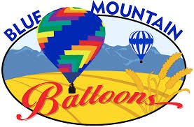
This is the logo for the original family business. They’d like to use this as an inspiration for the new logo.
Chase grew up hot air ballooning with his family and have always loved doing it. His father and uncle owned a hot air balloon tour business, which technically they’re inheriting, but need to change the name for legal reasons.
They’ve decided on “Airloom Balloon Co.” as a way to honor the heritage of their business. His uncle who ran the business recently passed away, and they wanted to pay tribute to him with the business name.

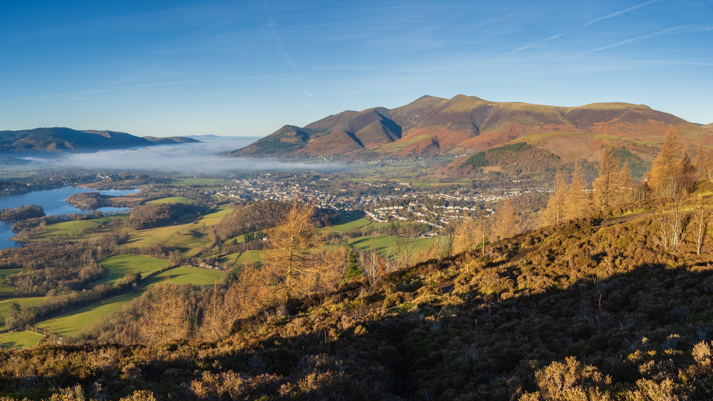


landscape
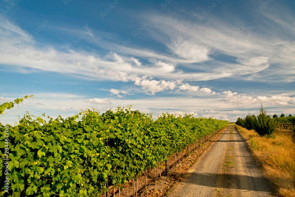
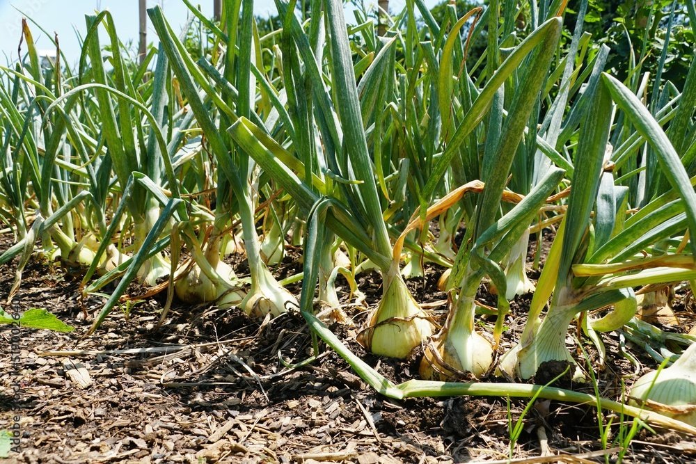
Southwest Washington - known for agriculture
famous “Walla Walla Sweet Onions”
wheat, vineyards, hops
Tight knit community
Thriving small business community
Washington wine country - pairs well with the history of wine and hot air balloons. Hot air balloons were invented in the Champagne region of France. It’s a tradition to pop a bottle of champagne after a hot air balloon ride—makes a partnership with a local winery ideal
style inspo
Minimalism
Optimistic
Nostalgic
Approachable, but classy
Idols: Reese Witherspoon, Joanna Gaines, David Rose from Schitt’s Creek
Nature inspired - wine country, wheat, famous “Walla Walla Sweet Onions”
Open to color, but more muted color
Makes the balloons the star of the show
Love circular logos


market
Tourists - leaning younger, but wealthy enough to vacation in wine country, primarily Pacific Northwesterners
Local boutique businesses to partner with, wineries, farms
Rural & urban
Young families
Couples
People who want to propose to their significant other
Older wine appreciators, retired


process


finals
after three rounds of revisions


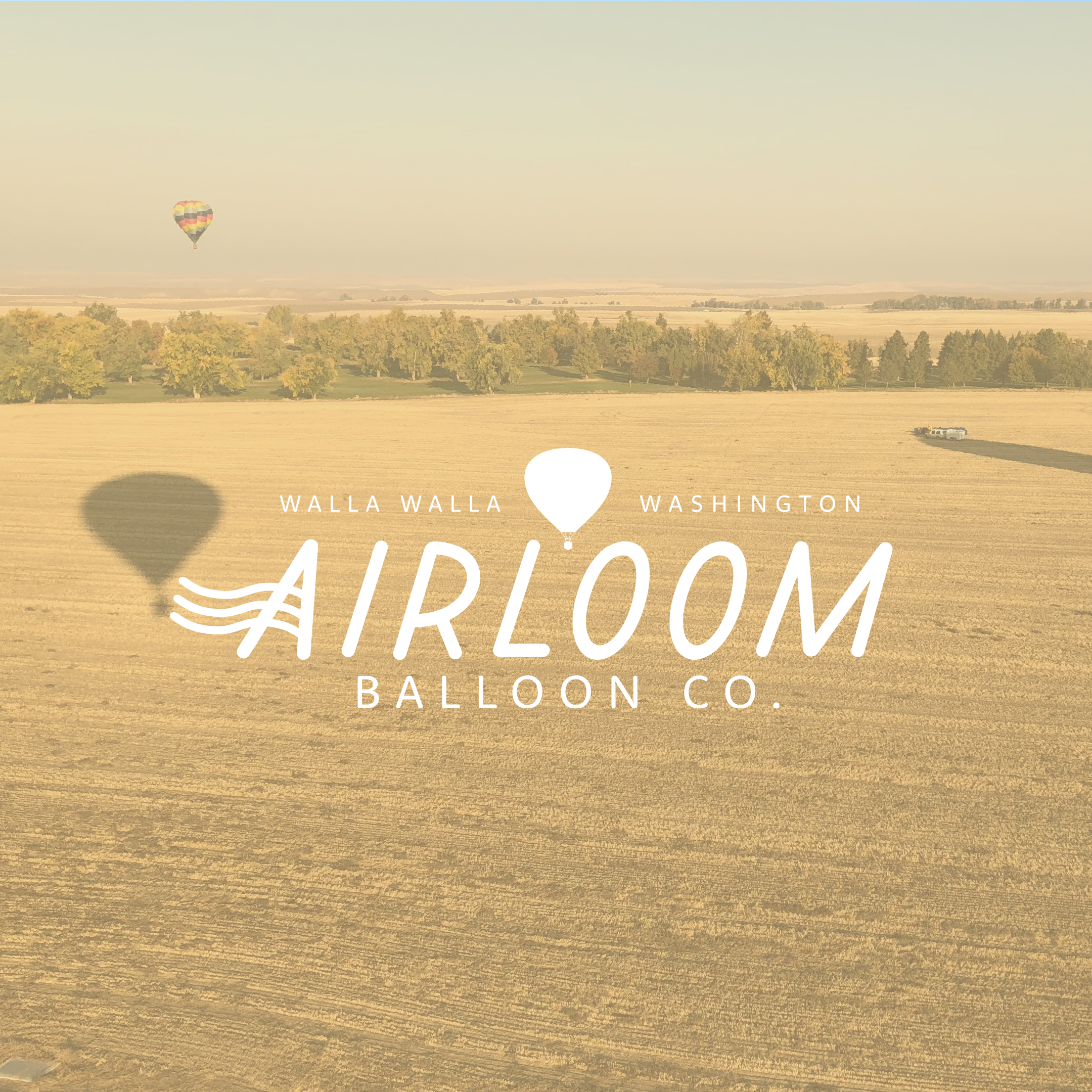

the “wavy a” concept
Draws upon:
The floating nature of a hot air balloon
The famous agricultural fields - lined, rolling hills of wheat, vineyards, onions, hops
Office stamp from a postcard


colors
The colors for Airloom Balloon Co. are based upon the kinds of things that you will see when you take a ride on one of their hot air balloons.
The bright morning sunshine.
Fields of wheat.
The evergreen trees in the hills beyond, and the green of the vineyards.
It’s optimistic, but not in your face about it.
my learning moments
This project was a bit further outside of my comfort zone as a designer. My clients really loved the ‘minimalist’ look. I do enjoy minimalism, but it’s just not my style, and so I had to experiment in a realm I wasn’t too familiar with.
When I first started designing, I was using some muted primary colors. I realized it was a bit too much next to imagery of a balloon, and not what these clients were drawn to. I scaled it back and tried to really focus on shape.
As I described it in one of our meetings, “Let the pictures of the balloons be the prom queen. The logo is her date. The logo is there to look good on its own, but make her shine.”
This project took several months to complete, as the scope of the business was bigger than what my other clients were doing—most of them are solo entrepreneurs.
While this is a two-person business right now, they will be serving a broad region of communities and will likely be growing at some point. I was setting the tone for this logo for years to come, as well as have the concept be inspiration for any future redesigns of the logo. That simply takes more time. This client needed a bit more time to make final decisions, and had more feedback than most of my other clients, but I was happy to accommodate their needs.